


The Root Cellar
Services: Brand Design · Print Collateral
Project Type: Brand Refresh
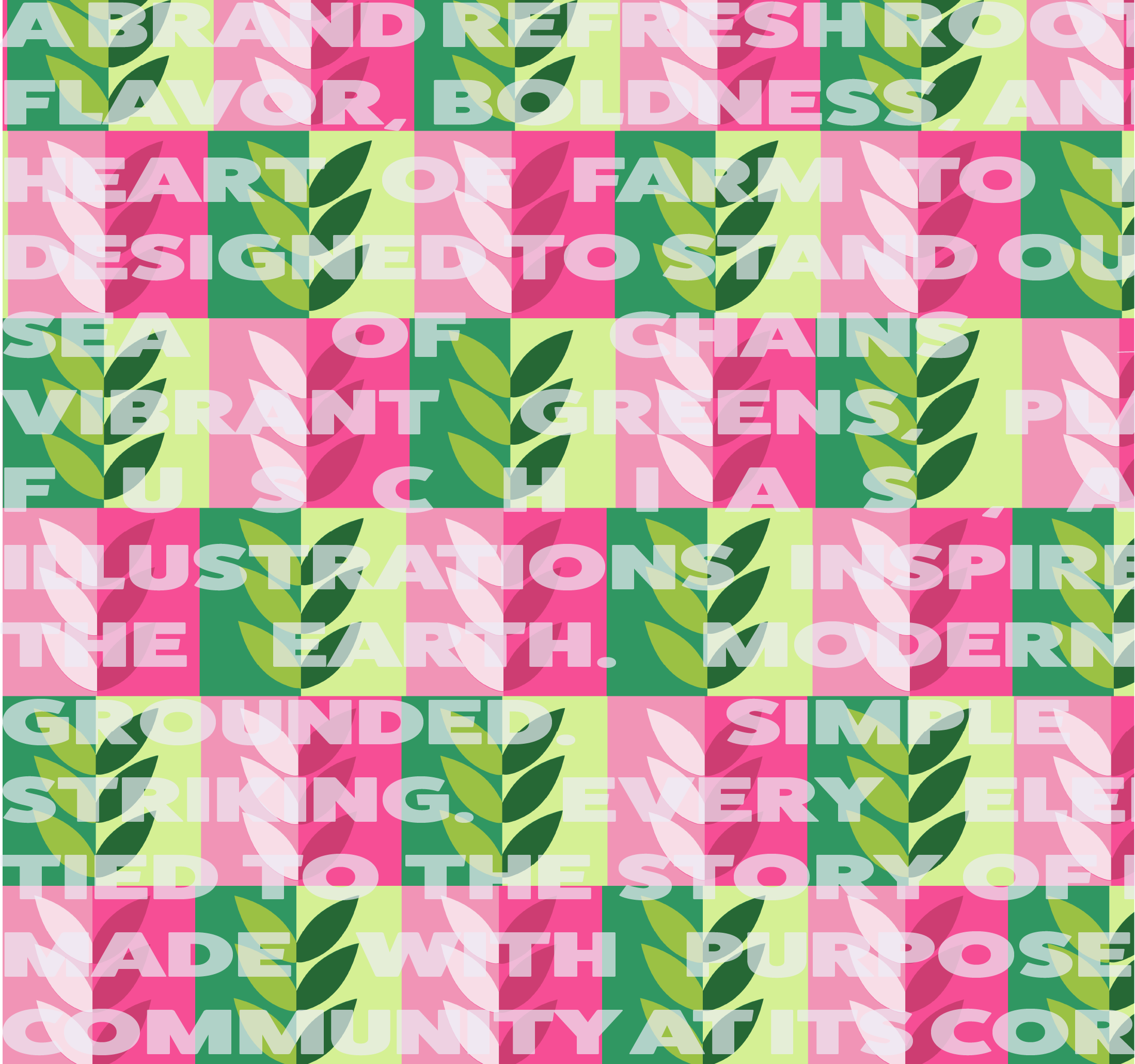
The Root Cellar came to me with deep roots and a clear need — a brand refresh that honored where they’d been, but more importantly, where they were headed. As a southern farm-to-table restaurant, they stood apart in their values and sourcing practices — but their visual identity didn’t reflect the vibrancy of what they offered.
In a sea of chain restaurants and traditional “country” aesthetics, they needed to claim their space — boldly, confidently, and with a voice that felt unmistakably their own.


Boldly Rooted: A Fresh Take on Farm-to-Table
We knew we wanted to break the mold.
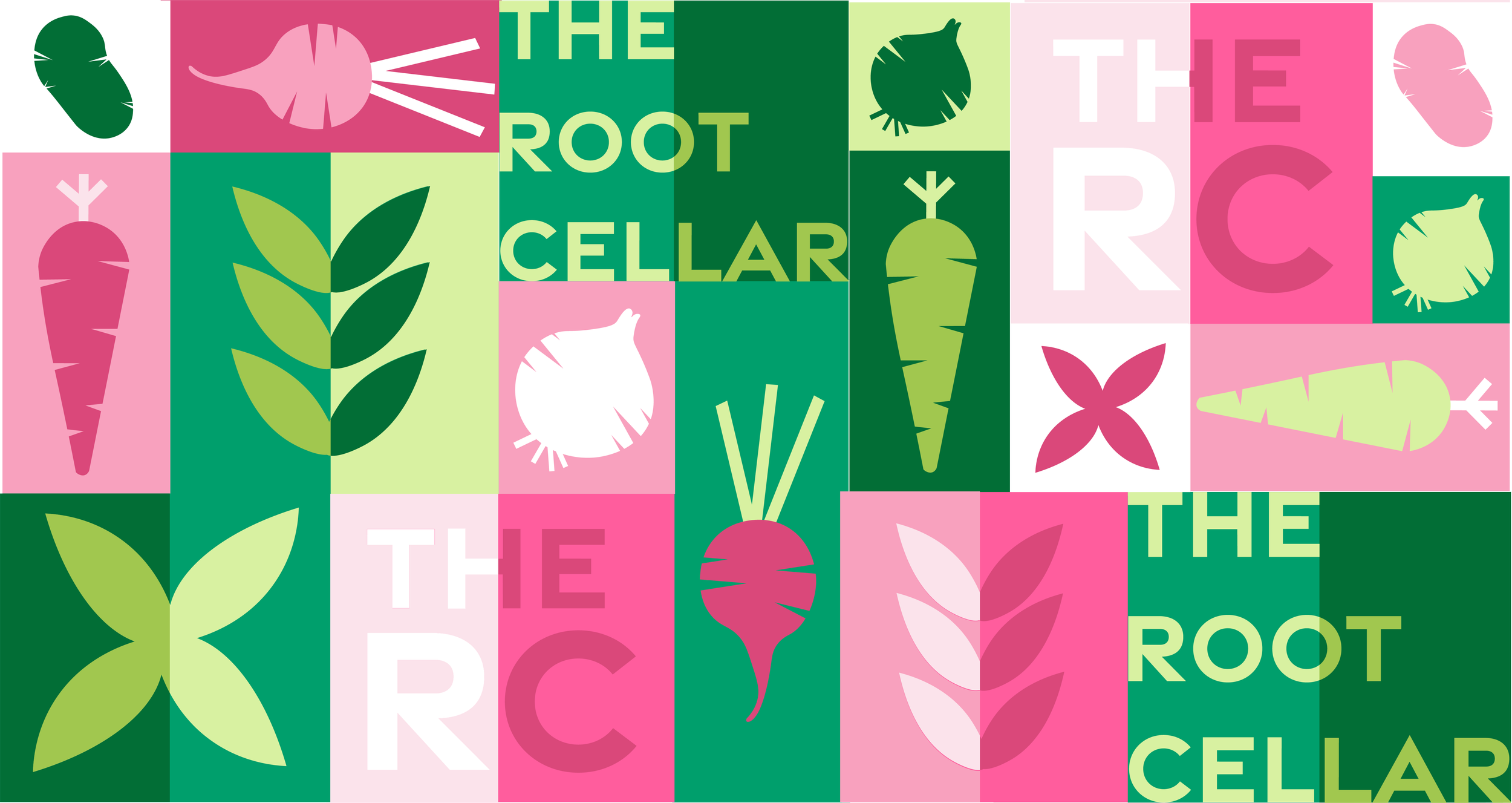
While farm-to-table often evokes muted palettes and rural nostalgia, we leaned into a direction that was fresh, geometric, and alive. Inspired by root vegetables and the boldness of real food pulled from the earth, the brand came to life with a high-contrast color palette of greens and fuchsias, structured typography, and custom illustrations that felt grounded yet elevated.
It was a love letter to their values — and a rally cry to their audience.


A full brand refresh rooted in clarity and boldness
Strategic messaging that reflected their growth and purpose
Custom illustrations inspired by organic forms + root vegetables
Marketing and print collateral that stood out in a crowded industry — from menus to window signage

Why It Matters
With their new brand, The Root Cellar now shows up with the presence and polish of a modern food brand — without losing the grounded ethos that makes them who they are.
This project wasn’t just about visuals. It was about honoring their story, elevating their voice, and helping them reconnect with their audience through aligned, strategic design.